


Creating charts using JDE project
TweetAs mentioned in other articles, XDE and JDE apps give you unlimited control on how your data will be displayed.
One of the popular uses is creating charts based on data series stored in Excel sheets or Access tables.
In this example we will show how you can create charts using JDE project and jQuery with Flot plotting library.
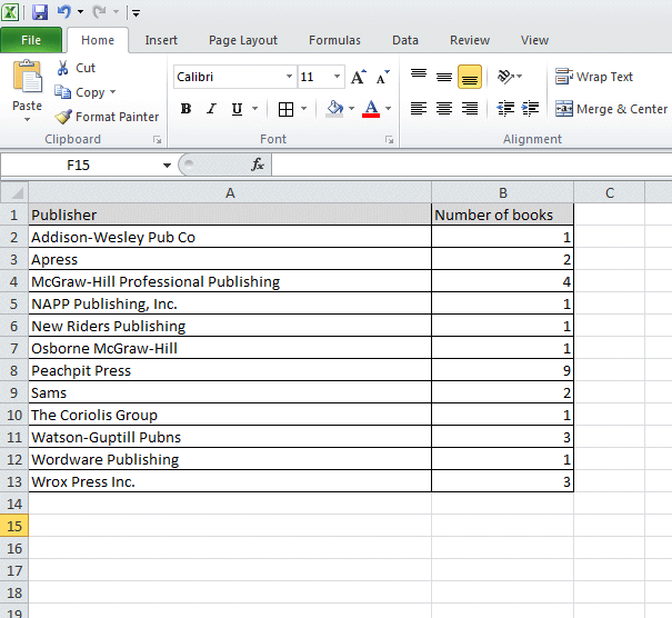
We will use this Excel sheet:
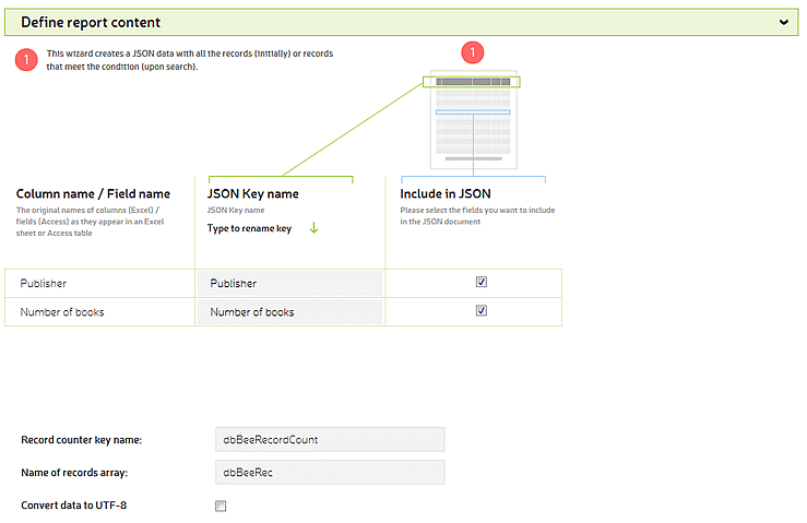
and create JDE project like this:
JSON data returned by this dbBee JDE application look like this:
{
	"dbBeeRecordCount": "12",
	"dbBeeRec": [{
		"Publisher": "Addison-Wesley Pub Co",
		"Number of books": "1"
	}, {
		"Publisher": "Apress",
		"Number of books": "2"
	}, {
		"Publisher": "McGraw-Hill Professional Publishing",
		"Number of books": "4"
	}, {
		"Publisher": "NAPP Publishing, Inc.",
		"Number of books": "1"
	}, {
		"Publisher": "New Riders Publishing",
		"Number of books": "1"
	}, {
		"Publisher": "Osborne McGraw-Hill",
		"Number of books": "1"
	}, {
		"Publisher": "Peachpit Press",
		"Number of books": "9"
	}, {
		"Publisher": "Sams",
		"Number of books": "2"
	}, {
		"Publisher": "The Coriolis Group",
		"Number of books": "1"
	}, {
		"Publisher": "Watson-Guptill Pubns",
		"Number of books": "3"
	}, {
		"Publisher": "Wordware Publishing",
		"Number of books": "1"
	}, {
		"Publisher": "Wrox Press Inc.",
		"Number of books": "3"
	}]
}
For this example we will also need the
jQuery and Flot library, so make sure that you have included it somewhere in
your page. If you do not have it included, use the code to shown below to
include it (make sure you upload the js files to your server):
<body>
	<!--[if lte IE 8]><script language="javascript" type="text/javascript" src="/js/excanvas.min.js"></script><![endif]-->
	<script language="javascript" type="text/javascript" src="/js/jquery-1.9.1.min.js"></script>
	<script language="javascript" type="text/javascript" src="/js/jquery.flot.js"></script>
	<script type="text/javascript">
		$(function() {
			$.getJSON('http://thyme.dbbee.com/u/SGCEQ5WZFZ/ByPublishersjsonapi.wbsp', function (data) {
				var ds = [];
				var lbl = [];
				var rc=parseInt(data.dbBeeRecordCount);
				for(i=0;i<rc;i++){
				ds.push([i,parseInt(data.dbBeeRec[i]['Number of books'])]);
				lbl.push([i,data.dbBeeRec[i].Publisher]);
				}
				$.plot($("#placeholder"), [ds], {
				bars: {
					show: true
				},
				xaxis: {
					ticks: lbl
				}
			});
			  });
		});
	</script>
<h1>Books in library by publishers</h1>
			<div id="placeholder" style="width:800px;height:600px;"></div>
</body>
Let’s analyze this code. It is basically single jQuery getJSON function with two parameters – the URL of JSON document (in this case URL of our JDE project) and a function to process loaded JSON document.
So once the host page is ready, jQuery function $. getJSON will fetch JSON from specified URL. When document is loaded our custom function will process the key "dbBeeRecordCount”, loop through array "dbBeeRec” and push values of keys "Number of books” and "Publisher” to arrays ds (data series) and lbl (tick labels) respectfully, and finally, function $.plot creates Flot chart using these arrays. See live demo here.
To make this example as simple as possible, we used the very basic formatting for Flot chart, but you can use all the options it offers. Also, you can use any other JavaScript charting library following the same procedure.
